TUTORIALS - CAR - Painted Illustrator / Photoshop I have created this tutorial years ago.. back in 2002. I decided to publish it again (for archiving purposes).. |
| This is an explanation how the BMW image was created. First of all I must have had some image to begin with (using as a template). In Illustrator I had to draw the outlines of the object (the car) with the pen tool (  ). ). |
 I drew each element of the car in a different layer (the order didn't matter at this time, because I drew only strokes with transparent fill) so after that I could export my ".ai" file into Photoshop without flattening the artwork. I drew each element of the car in a different layer (the order didn't matter at this time, because I drew only strokes with transparent fill) so after that I could export my ".ai" file into Photoshop without flattening the artwork. |
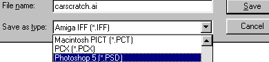
| When I was done with my scratch in Illustrator I chose: File> Export>Save as type - Photoshop 5. |
 In Photoshop I opened the already created .psd document (from Illustrator). Now I had to order the layers and start filling them with gradients. By clicking on each layer to select it and after that with the "magic wand tool" (  ) I clicked inside the element, so it would select the transparent area (and not the stroke/outline). I selected the gradient tool ( ) I clicked inside the element, so it would select the transparent area (and not the stroke/outline). I selected the gradient tool ( ) - at first I picked the colors that I wanted to fill the elements of the car (in this case from dark to light red, I used "linear" gradient) and started filling. Sometimes I needed to choose more than one color for the gradient filling (from the red gamma). ) - at first I picked the colors that I wanted to fill the elements of the car (in this case from dark to light red, I used "linear" gradient) and started filling. Sometimes I needed to choose more than one color for the gradient filling (from the red gamma). |
  ) to draw inside of the tire. Remember - each element is on a different layer. ) to draw inside of the tire. Remember - each element is on a different layer.  |
| Combined the wheels with the car, put each wheel on the bottom of the "layer palette" so it would be behind the car. Gradients still looked kind of funny, so I had to create some more lights and shadows to have a lively look of the car. |
 ) saved the paths - so if I wanted to go back and work some more I could always do that easily. After I was done with the path I chose "make selectoin from path" - here I could choose the "feather" for smoother selection - usualy I select "1". So when selection was active I went back to the "layer palette" and filled the layer with some color - dark (for shadows) or light (for lights) red. ) saved the paths - so if I wanted to go back and work some more I could always do that easily. After I was done with the path I chose "make selectoin from path" - here I could choose the "feather" for smoother selection - usualy I select "1". So when selection was active I went back to the "layer palette" and filled the layer with some color - dark (for shadows) or light (for lights) red. |
 After I was done with lights and shadows it was time to add the additional elements such as mirror, handle, symbols and headlights. It took me really quite long to fit these elements for the real look of the car. For example the headlights were a pain in the neck, I had to create some filters to fill the lights - in this case I chose "cristalize". |
| This is the final result. |
  |
Wednesday, September 7, 2011
Digital Painting - BMW
Subscribe to:
Post Comments (Atom)
No comments:
Post a Comment